Hot Images1Hot Images2Hot Images3Hot Images4Hot Images5
Showing posts with label 1st friday. Show all posts

Friday, November 4

Mark McCarty: Skin at Opalka Gallery

It is appropriate that the exhibition Mark McCarty: Skin at Sage College of Albany's Opalka Gallery begins with a self-portrait, because this show is as much about McCarty as it is about the many people depicted in it. Long awaited (McCarty's last solo show - aside from a wonderful mini-exhibition of iPhone pictures that just ended at McGreevy ProLab - was in 2004), comprehensive (the show presents 35 pieces, 36 if you count the one that is, inexplicably, included twice) and focused (all the works are black-and-white portraits) Skin happened because Opalka Director Jim Richard Wilson recognized that it needed to happen.

McCarty has been making both personal and commercial photographs for over 30 years, and both have brought him considerable recognition. But the effort to mount a major art exhibition is easy to leave aside when you are dealing with clients, raising a family, meeting deadlines. So McCarty continued to make the personal work - that's essential - but has tended to only show it in dribs and drabs, usually at one or another regional group exhibition.

Now, we have the opportunity to look at a broad and deep slice of those pictures - still limited to a particular long-term project or two, but a good choice was made to present a very personal segment of the total output, rather than a more diverse survey. It tells a deeply compelling story of lives written on the skin of those living in it, and of McCarty's place amid those lives as participant, observer, and compassionate collaborator.

Like a lot of commercial shooters, McCarty is well versed in a great array of technical skills and styles. This show includes a couple of grainy 35mm shots; 11 images from a square-format rollfilm camera; and 23 prints from 8-by-10-inch sheet film (these in two sizes). All the prints have been produced by digitally scanning the negatives and printing in ink on heavy paper - but you would hardly know it, as they have the look of gelatin-silver prints in texture and tonality.

More than half the pictures are of McCarty's immediate family - wife and children - including his first wife, Vicky, who died of cancer when their daughter, Kate, was still a baby. One of the most affecting images in the show (and no less so for being about 4 by 5 feet) shows Vicky and Kate from behind, their oval heads in rhythm, the regrown hair on Vicky's not nearly as thick as the first-grown hair on Kate's.

In this, as in nearly every image in the show, the subjects are unclothed; those who are not part of the nuclear family include a number of elderly Alzheimer's patients, and others of all ages. Almost never is the picture a "nude," though some get near that when the subject's face is obscured or cropped out. Not surprisingly, those tend to be the less compelling images.

The textures that give the show life are mainly those of the face, with all its lines and freckles, the hands (ditto) and, in certain strong instances, the hair and nails. One very expressive portrait of the photographers' nude second wife crops out her head, but allows her hands to receive the treatment of a sensitive portrait. Another image, of a woman identified as Emilee, shows mainly her torso from the side, folds of fat, stretch marks, scars and all. And another, of the only non-white person in the show (named Miss Ada), is full-face with eyes squeezed shut - but behind one set of lids, there's a hollow socket.

Though the pictures in Skin go back to 1985, it is worth noting that these last three were all made in 2011, clearly demonstrating that McCarty remains at the peak of his creative and expressive abilities. Still, the exhibition works very much as a whole, as a timeline of one life's intimacies and contiguous looks outward in the form of portraits. McCarty's world is here, as is his world view. It is a vital viewing experience.

Rating: Must See

Note: A very handsome catalog, with an opening statement by the artist and essays by Phyllis Galembo and Lyle Rexer, has been printed to accompany the exhibition Skin. Larger and more sumptuously designed than past Opalka catalogs, it is priced at $20, a nice deal. Be sure to check it out when you go.

Friday, October 7

MoHu

Some day we will all be bragging that we were here for the first MoHu festival. Let's get out there and make it real!

Friday, April 29

Graphic Design - Get the Message! at AIHA

Most of us have tried to figure out where you draw the line between fine art and commercial art. My own favorite answer to that slippery question is that it is entirely a matter of intent (not, as some would have it, a matter of quality).

This sentiment is mirrored by the opening quote of the wonderful exhibition Graphic Design - Get the Message! at the Albany Institute of History & Art (through June 12), which ponders that and more while making great use of the Institute's permanent collection and other local resources to present a broad swath of commercial design by talented artists over several centuries.

Organized into thematic sections (Foundations, Graphic Design and Commerce, Political and Social Messages, and The Creative Process), Get the Message! sprawls through four galleries and features seemingly countless original examples of printed matter in two and three dimensions, augmented by electronic, digital, and multi-media material - an appropriately dense barrage that captures so much of our overloaded everyday visual experience.

After an introductory room that touches on the range of themes with examples as intriguing and diverse as war propaganda posters and a powder-blue Tiffany box, the show delves into history with a large display of old-fashioned letterpress equipment and 19th-century broadsides that represent the birth of modern graphic style.

This room also holds a distracting installation of photographs and pulp bales illustrating the papermaking process as practiced today by key exhibition sponsor Mohawk Fine Papers. While it is a blessing to a struggling museum (is there any other kind these days?) to have such prominent corporate underwriting, I must say it's a shame to see it come at this sort of price.

The next, largest gallery puts out the really colorful stuff we readily think of as showcasing the classic elements of graphic design - illustration and typography - in the form of bright and clever posters from the past hundred or so years (examples shown at the top of this post, and above at left).

It could be argued that the 20th century, with its political causes, social unrest, and explosion of commercial advertising, was the golden age of graphic design, and this room shows why. Whether selling war bonds, popular entertainment, educational toys, or soap, the artists behind these designs knew how to get our attention and make a lasting impression.

I had the company of an old friend and longtime graphic designer on this visit, and it was a pleasure to watch how he viewed the work in this section - moving in close and often marveling at the fine-art techniques, such as charcoal drawing and oil painting, that were employed in the service of these pitches. He frequently commented with amazement at the elaborate lettering that these pre-computer artists routinely hand-painted - a nearly lost art today.

For me, it was the simplest designs that held up the best. One artist featured prominently throughout the exhibition is Woody Pirtle, an internationally-known designer active in the Hudson Valley, whose politically-charged posters use color, shape, type, and iconic images in effortless concert to illuminate, anger, or amuse (example shown above at right).

Pirtle is among several top creators - all with local connections - featured in the last section of the show (Creative Process). The others are illustrators Dahl Taylor and William Westwood; design firms Vicarious Visions and Spiral Design; and early 20th-century designers Will H. Low and Hajo Christoph. All are of the highest quality in the business and have found significant commercial success - who knew the Capital Region was such a hotbed of creative design?

The Creative Process section has the expected preparatory sketches and such, but it also shows elements of the commercial design world not typically seen outside its own confines - promotional pieces in expensively elaborate detail that design firms use to give clients an idea of what they can do. Here, Spiral Design is the mind-blower, and it's here that I think the line gets crossed back over into fine art - because, in this case, the client is the artist, and the intention is to show the artist's skill. It's some pretty amazing stuff, from all the participants, and an impressive capstone to the show's historical lead-in.

Hajo, as he was known, is also featured in a separate exhibition one floor up from Get the Message! that details his personal journey from Berlin to Castleton, where he forged a career designing witty and sophisticated packaging for many local manufacturers (example shown at the bottom of this post). There are abundant examples of Hajo's extraordinary work in both exhibitions, including delightful personal art in watercolor, oils, gouache, and other media.

By the way - here's the quote that starts the exhibition, from Paul Rand (world-famous designer of iconic logos for firms such as IBM, ABC and UPS):

Design is the method of putting form and content together.
Design, just as art, has multiple definitions; there is no single definition.
Design can be art. Design can be aesthetics. Design is so simple, that's why it is so complicated.

Food for thought, no?

Rating: Highly Recommended

Note: Throughout the run of Graphic Design - Get the Message!, there has been a series of related lectures and events. The next two are coming soon - at 6 p.m. on Friday, May 6 (in conjunction with First Friday), illustrators Dahl Taylor and William Westwood will present; and at 2 p.m. on Sunday, May 8, Ellen Lupton, the author of Thinking with Type and other design guides, will address the topic How to Do Things with Typography: Introduction to an Art.

Further on, at 2 p.m. on May 22, graphic designer, typographer and calligrapher Paul Shaw will speak and sign his latest book, Helvetica and the New York Subway System; and at 6 p.m. on June 3, Laura Shore will speak on the topic The Truth About Paper.

All the events are free.

Thursday, March 3

2011 Mohawk Hudson Regional Invitational at Albany Center Gallery

The above card announces Albany Center Gallery's annual invitational drawn from participants in the latest Mohawk Hudson Regional; the show has a reception on Friday, March 4, from 6-8 p.m. as part of Albany's monthly 1st Friday festivities.

It is a beautiful show (I should know because I curated it), made up of organically derived imagery in thrilling color as well as subtle black-and-white by a trio of regional mid-career artists. Amy Cheng, Katie DeGroot, and Douglas Durning have not had their work showcased in Albany before, making this a unique opportunity, and the combination of the three is very strong. Of course, that's just my extremely biased opinion.

Come see for yourself: You are invited to join me and two of the artists at the 1st Friday reception. A second chance will arrive with a closing reception set for Friday, April 1, from 6-8 p.m. - the third artist will be present for that one, and you are also invited to join us then.

Friday, January 21

The World According to Willie

Willie Marlowe: A Survey 1977-2010 has opened at Sage College of Albany's Opalka Gallery; there will be an artist's reception there on 1st Friday, Feb. 4, from 5-9 p.m.

I've seen the exhibition, and it is exquisite. But, because I was commissioned to write an essay for the show's catalog (which also contains an essay by E. Tornai Thyssen), I won't be writing a review. Instead, below are a few key images from the show, along with the text of my essay. Naturally, I highly recommend you go see this wonderful work.

Hot Coals and Feather Moon 2009 mixed media on paper 13.5" x 21"

The World According to Willie

It’s been almost 30 years since I first met Willie Marlowe, but she never ceases to amaze me. Demurely Southern, with a deliciously acerbic undertone, Marlowe is quiet but frank, extremely reliable, and remarkably committed to her work. For the many years she taught at Sage, she was also strongly committed to the students – but there was never any doubt that painting came first, clearly manifested in a relentlessly constant studio practice, which in turn set a fine example for her devoted students to follow.

I see Marlowe as having had two sides all these years: The single-minded painter isolated in her studio, continuously bringing mountains of rich artwork to life; and the joyful, attentive friend, teacher, and collaborator who issued a steady stream of letters (and, after a certain date, e-mails) as well as mail-art pieces and curatorial projects, all bearing unparalleled enthusiasm for other artists’ activities. She is that increasingly rare person who always picks up the phone if you dial her number. Yes, she’s home in the studio painting feverishly and, of course, she has time to talk.

Painters do work in isolation – it’s a necessity – and, as with all good painters, Marlowe’s work is truly a world unto itself. With the majority of her pieces being small and jewel-like, suggestive but usually abstract, and created with non-traditional techniques, it would be easy to think that they represent a primarily inward-looking process. However, that would be a grave misapprehension. In fact, Marlowe’s work is deeply informed by the world around her, and particularly by her travels.

A brilliant colorist, Marlowe added black to her palette after stints as a visiting artist in Barbados in 1986 and the Yucatan Peninsula in 1993, where she experienced the sudden drops to nightfall typical of places near the equator. The vivifying effect of black on the other colors she employs recalls for me another favorite painter, Henri Matisse. Caribbean influence also appears in the lushly lit and exotically populated underwater gardens of many of her paintings made in that period and since. And a longtime theme of houses took on new flavor with the hurricane-threatened shacks of another series that came out of those island visits.

Adding to the Mayan-inspired ziggurats and labyrinths that have always fascinated Marlowe (and which show up in tantalizing concrete poetry pieces as well as recent digital paintings), trips to Ireland in 1997, 2001, and 2005 brought ancient stone monoliths into her daily vocabulary. They found good company there with Marlowe’s various references to cave paintings, calligraphy, architecture, and historic maps. And then there’s Venice, which she visited in 1984 and 1989 and then returned to in 2006, 2008, and 2010 for artist’s residencies.

As a source for Marlowe’s dazzlingly layered and transparent colors, Venice is almost too obvious. The sun glinting off the water, the fresh and weathered colors of the houses and palazzos, and the mesmerizing glass, born in fire, all fit Marlowe’s vision like a glove (one 2010 example, titled Glass Games, is shown above at right). Recent years have found her spending longer and longer stints in that magical island city, where incidental facts of life such as the absence of cars and the presence of cats resonate with the Willie Marlowe I have always known, and where she clearly comes alive in new ways.

The work inspired by her stays in Venice is perhaps most meaningfully captured in Marlowe’s use of portals. The city has countless covered passageways, doors, and windows that suggest these arched entries into and out of the paintings. While her work has always been given to structure, the more recent Venice paintings take on new aspects of architectural rigor, sometimes flattened into pre-Renaissance perspective, other times opened into multiple dimensions. Stage-like spaces are often suggested as well, wherein Marlowe’s biomorphic figures dance and swirl, a connecting element through most of her work, whether painted, constructed or collaged, whether brightly colored or in black and white, whether shiny, flat or textured. These gestural forms represent life, ideas, dreams, poetry, fabric and glass – everything that embodies the precious elements of Willie’s world.

Stepping into that world through any of the many entries she offers gives the viewer of a Marlowe painting or series a new experience, belying the deeply historic sources that inform it. Ultimately, it is this freshness, inexplicably available to the painter in her studio over decades of constant effort, that makes the work irresistible. Equally, the artist’s rigorous attention to detail, masterful technique, and commitment to a personal vision make it lasting – and important.
David Brickman, October 2010

Wingspan 2010 modular installation, acrylic on paper mounted on wood panels, 80" x 110"

Sunday, January 9

Child is Father to the Man: Thomas D'Ambrose and RADICAL! at Albany Center Gallery


A very snowy 1st Friday kept the throngs at bay, but a good turnout of devoted fans still made it to the opening of a two-person show titled Eco Primitive Eco Surreal at Albany Center Gallery.

The inspired pairing of Thomas D'Ambrose and RADICAL! makes for a somewhat mind-bending experience, as the two artists are almost diametrically opposed, psychologically speaking, and their technical approaches are also in deep contrast. Yet it works beautifully, finding lots of common ground in terms of scale, subject matter, and delivery.

D'Ambrose, well into middle age, draws and paints like a child, usually depicting happy, frolicking animals. RADICAL!, a pseudonymous graffiti-style artist just 19 years old, applies masterful technique to a panoply of grotesque characters immersed in drugs, violence, even shades of bestiality.

Still, an innocent optimism lurks beneath the surface of the Hudson Valley Community College sophomore's creepy universe, mysteriously mirroring the uncomplicated sweetness of his elder's world view. The combination is surprisingly bracing, lending a bit of gravity to D'Ambrose while picking up the lightness of RADICAL!'s nightmares.

I was already convinced of RADICAL!'s significance as an artist before this show, which demonstrates growth and strength as he adds more three-dimensional elements and new figurative aspects to his graphic style. Now, I have a greater respect for D'Ambrose, whose musical career focus and extreme modesty had led me to take his art less seriously in the past. Here, he displays a greater diversity and a more complex sense of color and texture than I had previously seen.

Altogether, a great start to the new year's exhibition calendar.

Rating: Highly Recommended

Tuesday, November 30

African American Abstract Masters at Opalka Gallery

I went to see African American Abstract Masters at The Sage Colleges' Opalka Gallery expecting a history lesson - and I got one - but I was delighted to find that the history this show covers goes all the way to the present.

The Opalka has presented important shows of AbEx artists throughout its tenure, one of which was a solo a few years ago by Frank Wimberley, who has two pieces in this exhibition (including the one shown at right). That kind of continuity and adherence to a mission is nice to see in a college gallery, and we're lucky to receive the benefits of Gallery Director Jim Richard Wilson's deep and long-term interest in this vital segment of American painting.

African American Abstract Masters was curated by Mary Anne Rose and organized by Anita Shapolsky Gallery and Wilmer Jennings Gallery at Kenkeleba, both of which showed the work last spring in New York City. The current installment of Rose's choices features 14 artists, nine of whom are represented by two works each; of the rest, one has three pieces and four have just one in the show, making a total of 25 pieces dating from 1949 to 2009.

The broad time frame of the works included, and the many pairings (most of which bridge decades), affords wonderful opportunities to compare and contrast the evolution of painting styles, both in general and by individual artists. For example, Ed Clark's two pieces are dated 1978 and 2009 (the latter is shown at the top of this post), yet they are of similar scale, share the same medium (acrylic), and are both made with sweeping strokes of a pushbroom-sized brush. Even so, each has the feel of its particular time.

Conversely, Joe Overstreet's two paintings, also 30 years apart, could have been made by two different artists - the one from 1960 is loopily colorful and energetic, while the one from 1990 is in black and white and has strictly constructed geometry. Yet Overstreet can't be accused of inconsistency - each of these paintings ranks among the strongest pieces in the show.

Not all the work in the show is purely abstract. The earliest piece, Harlan Jackson's Mask No. II (from 1949; shown above at left), has the primitive art and rituals of Haiti as a source, and is properly placed in time at the apex of American painting's transition from Surrealism and Cubism into Abstract Expressionism. It reminded me of work from the same period by Jackson Pollock, before he launched into the drips, and truly reflects the roots of the AbEx movement.

Other transitional work in the show includes the Theosophistic 1953 Composition by Thomas Sills and Betty Blayton's two pieces, Forced Right (from 1975; shown at the bottom of this post) and Riot (from 1967), which have figurative references. Blayton is one of just two women in the show - hardly surprising, considering the time and context. While it was surely pretty difficult to make it as a black artist in the '50s and '60s, it was equally tough to make it as a woman painter in the macho world of Abstract Expressionists - so for a black woman it had to be nearly impossible.

The other woman, Alma Thomas, is represented by a watercolor, one of the few works on paper in the show. Hers is a muscular but muted study in red and black that has a nice dialogue going with a similarly sized piece opposite it that is one of the show's unqualified gems. Titled Study in Black and White, this gouache on paper is by Sam Middleton - but it could just as easily be by one of his far more famous contemporaries (say Motherwell or Gottlieb). No wonder it is part of the curator's personal collection.

Other notable works in the show include an outstanding Norman Lewis painting (shown above at right); the two Wimberleys (also about 30 years apart and providing a thought-provoking contrast); and the only print in the show, a sweet piece by the genius lithographer Robert Blackburn titled Faux Pas.

It's not too late to see African American Abstract Masters, but don't delay - the show ends on Dec. 12.

Rating: Highly Recommended


Also involving compelling abstract art, an exhibition at The College of Saint Rose's Esther Massry Gallery by Creighton Michael will have its artist's reception as part of the 1st Friday events for December (from 5 - 9 p.m. on Friday, Dec. 3). Michael, who will speak in nearby St. Joseph Auditorium on Friday at 7 p.m., uses three-dimensional "marks" to create works that range from wall-mounted squares of small objects to a room-sized installation - all of which he refers to as drawings.

Tangible Marking: The Dimensional Drawings of Creighton Michael opened on Nov. 14 and will continue through Jan. 23, when a special music performance related to the show will take place in the gallery.

For more 1st Friday information, click here.

Friday, September 17

The Arc of a Life: Olitski at Opalka

Sometimes when a painter makes prints they seem to be a secondary medium rather than a part of the artist’s essential personal expression. The opposite is true of Jules Olitski: An Inside View, currently showing at the Opalka Gallery at Sage College of Albany, where the prints clearly delineate a vital thread at the center of the painter’s life.

An Inside View was organized by the Brattleboro Museum & Art Center in 2008, shortly after the celebrated abstract expressionist’s death, and has been traveling since then. We are fortunate that this wonderfully envisioned survey has a stop here (before it moves on to the Everson Museum of Art in Syracuse). Comprising 47 works from 1954 to 2007, the show is carefully culled into manageable groups from several distinct periods arranged chronologically around the big, bright room.

It isn’t always best to present a lifetime of effort in time order, but here it works perfectly. We begin with two groupings of small, dark etchings from the 1950s placed on opposite walls in the gallery’s large entry space. These have the immediate effect of communicating Olitski’s early and direct involvement with printmaking and its special qualities.

Some of the early etchings are presented in multiple states, further expressing just how different this medium is from drawing or painting. In one example from 1954, titled Drawing Number One, three states show the progression from a spare study of shapes to a smoke-filled gloom; though each clearly leads to the next, these three prints remain remarkably individual.

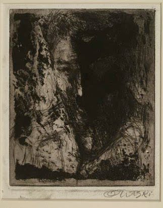
The five small prints opposite tell a different story. Each is a self-portrait, representing the first, fourth, sixth, seventh and ninth states of a 1956 series that, apparently, could have gone on forever. I don’t know enough about etching to explain the process, but the images (presented in order) bounce back and forth from sharply delineated lines and forms to blurred and heavy masses. In all of them, a recognizable face gazes over the viewer’s shoulder, lost in introspection; what is striking is how completely different in mood each of these young Jules Olitskis appears.

After the darker early work, we jump to a whole new world, full of color, possibility, and joy. Olitski’s Anna series of lithographs, from 1969, are a bit bigger than the etchings, open and playful, with loose scribbles of hue and floating shapes. Then, his 1970 Graphics Suite #1 takes it further, using the bright inks of silkscreen to present speckled color fields on a more substantial scale (28 x 36 inches). Here, rich shades of pink, blue, ochre, red, and purple are activated by their own textures and by marks and lines at the edges of the compositions (notably, of the eight, only one is horizontal).

Another jump takes us to 1986, where the piece titled Toora (seen at the bottom of this post) nails down the Graphics Suite theme into a contrasty, more energetic crystallization, before giving way to new gestural impulses in other silkscreens from later in the '80s. Then, Olitski adopts yet another medium, the monotype – and he never looks back. His seminal 1994 monotype Without Sin (seen at the top of this post) is pure, painterly gesture.

Further explorations hint at, and then depict, actual landscapes (supported by titles such as Lake Lorrain and Breaking Light), and then, in the artist’s latest years, return to figurative and symbolic representations. Finally, Olitski unabashedly celebrates the freedom of expression that comes to many elderly people by making smaller, more intimate monotypes of memories, childlike sailboats, a vibrant dancer, and a haunting face peering out of the darkness of the past.

This major painter has left a fine legacy in these prints. Be sure to see them.

Jules Olitski: An Inside View will remain on view through Oct. 31. A reception will be held from 5 to 9 p.m. on Oct. 1 (1st Friday). As part of the reception, Olitski's widow, Kristina, and daughter Lauren Olitski Poster will speak at 7 p.m.

Thursday, June 3

Tomorrow's Masters Today reception at AIHA

I may not have a chance to post a review this week, so here's a little teaser instead: The Albany Institute of History & Art will hold a reception during Albany's 1st Friday events for a show of 50 works by 50 artists called Tomorrow's Masters Today. A few of the pieces are reproduced here (that's Christopher Lisio above, Scott Donohue at right and Susan Stuart below).

If you want to have a look at all the artworks, click here to visit the Institute's page for the exhibition. There's a Gala the following Friday for the well-enough-heeled, and all the art will be available for sale through a silent auction. Full disclosure: I am also included. Hope to see you there!

Saturday, March 27

"It's The Thread That Binds" at Albany Center Gallery

We used to think that fine art means oil paintings, cast-bronze sculptures, and maybe a nice charcoal drawing or limited-edition print - but times have changed, and even conservative thinkers recognize that media once reserved for the trades, such as glass and wood, or materials previously unassociated with creativity, such as found objects or Mylar-wrapped candies, are also acceptable as the stuff that museums compete to show and collect.

It's The Thread That Binds, an exhibition of work by newcomers Sierra Furtwangler and Jennifer Hunold at Albany Center Gallery, has paired two fiber artists who play at opposite ends of the art-craft-nostalgia continuum that characterizes the current interaction of postmodern thought with folksy materials. On one hand, we have the 21st-century musings of house-hunter Hunold, who expresses herself humbly in the 17th-century media of embroidery and cross-stitch; on the other hand, there are Furtwangler's oversized stuffed animals, charmingly and naively sewn, but with fangs and breasts and genitals flamboyantly displayed.

Hunold presents two series - colorful thread embroideries of "dream house" floor plans, and cross-stitched aphorisms coded to current moral issues - along with a few related odds and ends. Her obsession with the ideal home is a fairly universal one, but the variations she offers do little to transcend the banality of that American dream. When she lets herself go a bit, whether through fanciful patterns or a slightly edgier concept, Hunold starts to become engaging.

But the cross-stitched pieces, while trying to amuse, are cute at best, and overall really cloying. For example, the one titled Soap + H20 = Nice has no irony or humor - it actually serves specifically to tell us that it's nice to be clean. Another lampoons annoying drivers who honk too loudly when we don't jump off the line at a freshly turned green light. A light tap will do, Hunold sweetly scolds.

These pieces underline the bland sincerity of Hunold's domestic dreaming, which leaves much to be desired. Were she to aim her medium toward subverting our perceptions of embroidered mottoes and samplers by sending stronger messages of our times, Hunold might begin to get somewhere interesting.

Fortunately, Furtwangler has no such timidity. Her sewn and stuffed monsters, mermaids, and monkeys are as fearsome as they are furry and funny. Occupying the space as fully ensconced inhabitants, they both seduce and surprise. One, titled This Is Not A Sloth (Tip of My Rod), jumps out at you from above, a primate that sports a huge, red-tipped pecker and sneers (or smiles?) while hanging upside down from a tree branch (all ingeniously made of printed fabric).

Another monkey figure squats desultorily but menacingly in a corner, shreds of an Oriental rug marking the trail of its retreat. Pieces of carpeting form important parts of other Furtwangler pieces as well, just one example of her capacity to find new ways to use available materials.

The gallery's promotional description of Furtwangler's influences - "the painting of Hieronymous Bosch and Francisco de Goya ... comic books, tattoo culture, 1980s LA punk rock lore, horror movies, Catholic iconography, taxidermy and biological illustration" - says a lot about how fresh and challenging this artist is. She is definitely one to watch.

It's The Thread That Binds continues through April 17; it will be open during Albany's monthly 1st Friday event on April 2. To watch a video of a discussion with the artists, click here.

Friday, February 5

A Special 1st Friday

Just a quick heads-up for all you culture vultures out there - tonight's 1st Friday in Albany has a lot to offer (and no snowstorms on the way that I know about), so plan to get out and take advantage. Among the items on my list:
  • Larry Poons, renowned abstract painter, will talk about his show at The College of Saint Rose's Massry Gallery beginning at 7 p.m.

  • An exhibition of magically lighted black-and-white photographs taken in Egypt by Sarite Sanders is featured at the Albany Institute of History & Art, which always offers free admission (and nice munchies) on 1st Friday.

  • and the Contompasis brothers' reborn Marketplace Gallery (40 Broadway) will be open for the first time after a devastating fire wiped it out last fall. Today's Times Union tells the story here. The party there typically lasts all weekend, so go early and often.

Of course there's much, much more - you can get details and a PDF map by going to the 1st Friday website ... or find one in the current Metroland. Events begin at 5 p.m.

See you there!

Friday, January 22

Then & Now at Albany Center Gallery

A fine show fills the intimate spaces of Albany Center Gallery for its Then & Now exhibition, the latest in an annual series that brings artists who have previously shown at the gallery back for a fresh look. The 2010 edition of Then & Now features three women in mid-career who work in diverse media but have a strong affinity in their approaches to form, color, and content, making this a very well-matched selection.

Mimi Czajka Graminski is essentially an installation artist who works in fiber. Her Knit Cones (shown at left) uses knitted wool and other fibers to make repeated hat shapes that are then grouped, distorted, and arranged differently for each installation. Many of the cones as presented in this show (there are more than 40 total) are folded in on themselves, emphasizing their resemblance to nipples; unfolded they seem like elongated breasts, an image that feminist artists commonly employ. Fortunately, Graminski doesn't take her work over-seriously, and the total formation of the colorful cones in a space about 10 feet wide is pleasantly playful.

Graminski extends this sense of play in three serial grids of embroidery on linen titled Morning, Evening, and Dawn. Unframed and floating a bit off the wall, the groups are highly textured, with vivid colors of thread and simple, almost childish imagery. The best of them, Dawn, relies on a teardrop motif and incorporates a lot of cutouts and additions to build dimension.

Graminski also occupies the gallery's most open space with two groups of forms in crocheted tulle fabric of bright, earthy, and pastel colors. Each group of six, suspended from invisible wires to make them appear to be free-standing, feels vaguely figurative; those titled Grow huddle together, while the taller shapes of Forgiveness appear to march across the space.

The painter Iona Park combines some unusual media in her gently cerebral, square meditations on landscape. Casein, gesso, dry pigment, and paper are among the materials she spreads, drips, polishes, sands, incises, rubs, wrinkles, and burns to arrive at deeply textural surfaces that must be examined up close to be properly felt.

All of Park's compositions work with a similar structure - usually one or two clear horizon lines and always a busy thicket of vertical gestures - yet there is plenty of freedom in them and a great deal of variety in the results. As interesting and emotive as her colors become, her titles are often evocative, too, adding to the poetry of this smoldering work (shown above at right is Effloresce; below at right is Carapace).

Park's paintings are small. Of the fifteen presented here, twelve are just a foot square, and three are 18 inches square, and they are arranged in such a way as to allow the viewer plenty of time and space for contemplation. It works perfectly.

Photographer Jeri Eisenberg completes the trio, with 11 works in her by-now recognizable modular style that breaks images into one-by-three-foot vertical strips of Oriental paper (hung in an ingenious free-floating manner with powerful magnets).

Like Graminski and Park, Eisenberg draws from nature but pulls toward abstraction and pure color. The range from yellow to red, with a lot of pure white setting it off, comes from the flowers and fall foliage she photographs, but Eisenberg's out-of-focus capture and ink-softened digital output gives these colors an even more ethereal presence than the delicate, dying forms they represent.

Then there is the structure of Eisenberg's "panels," which create a vertical image if one or two are used, a square with three, or a horizontal when four are put together (the show features all these options; a four-panel one is shown below). This design is clearly inspired by Japanese or Chinese scrolls and screens, and is compatible with Eisenberg's rather Oriental approach to nature in her art.

By employing the sequence of technical manipulations that result in these lovely creations (including the incorporation of encaustic), Eisenberg has all but left photography's traditions behind. Yet, they remain photographs, an important assertion that gives them a strength and directness they would lack if painted.

This work has gotten quite a bit of national attention in recent years, and it's easy to see why. Combining Eisenberg with the equally accomplished Graminski and Park makes this the region's first must-see show of 2010.

Then & Now is open through Feb. 27; there will be an artists' reception at the gallery during Albany's 1st Friday event from 6 to 8 p.m. on Friday, Feb. 5.

Jeri Eisenberg Ornamentals, No. 5 pigment ink on kozo paper with encaustic

Thursday, December 3

Dona Ann McAdams at Opalka Gallery

Geary Street, San Francisco, 1974 gelatin silver print by Dona Ann McAdams

The final exams are over, and the grad student is back to blogging - just in time to talk about an almost absurd abundance of important photography shows going on right here in the fair city of Albany. They include Keith Carter at The College of Saint Rose's Massry Gallery through Jan. 17; a large group of Depression-era photographs at the New York State Museum through March 14; and Berenice Abbott, also at the NYSM and now extended through Jan. 3. I wrote about the Abbott show in an earlier post, and will weigh in soon on the other two.

But first up is Some Women, a solo show by Dona Ann McAdams at Sage College of Albany's Opalka Gallery through Dec. 16 (note: the show was originally scheduled to end on Dec. 11 but has been extended). A collection of 35 gelatin silver prints from 35 years of photographing (mostly) in the street, Some Women is both a personal retrospective and an homage to street photography itself; the title is a purposeful evocation of a very influential book from that genre's heyday, Women are Beautiful by Garry Winogrand, whose work McAdams' sometimes very much resembles.

McAdams' work can also look like that of Henri Cartier-Bresson, Robert Frank, William Klein, and Lee Friedlander - comparisons that I imagine have already been made many times, and that I trust will not bother her in the least, because they are both apt and instructive. At any rate, the resemblances don't diminish this work one bit: it is, honestly, just as good as that of those great earlier photographers, and - most important - has its own clear voice.

McAdams is a fun study, because her work crosses so many boundaries and mixes freely from contrasting sources. First, there is the nostalgia of her traditional, rigorous 35mm black-and-white technique, right down to the 12" x18" darkroom-made prints - in this digital world, we don't see much of that anymore, and it is still refreshingly direct and visually rich. Second, McAdams is extremely politically engaged - yet, thankfully, her work does not put you off with strident messages.

Like all the sincere (I hope) documentarians whose shoulders she happily straddles, McAdams records the world as she experiences it, which in her case means with great sensitivity, clear-eyed passion, a healthy sense of humor, and a very open mind. I expected feminism from this show, and McAdams is most definitely an unapologetic feminist - but not of the sort you worry about running into at a cocktail party; rather, she quite honestly and convincingly portrays women and girls, some of whom are involved in political acts, but most of whom are simply living their lives the best they can, and nearly always looking enchanting as they go about their business.

The range here is impressive, from innocent tots to performance artists, prostitutes to nuns. In a few cases, there is no female person visible in the shot - one shows a well-lived-in room where photo portraits are the only concrete presence of humans; another depicts a crowd of well-dressed young men on Bourbon Street in New Orleans during Mardi Gras - we follow their interested gazes upward and understand they must be watching a woman on a passing float, presumably in some flagrant display of her charms.

But the rest are quite direct - many of them are portraits, always affectionate (like the one above at right), and many are chance encounters that share the pathos of the situation before the camera (such as the image at the bottom of this post). With these, the gallery has added to the fun by creating telling juxtapositions, such as placing a somewhat chaotic Barcelona street scene in which a couple appear at first to be dancing, then to be fighting, next to an equally off-kilter shot from New York City in which women of various shapes are dressed for a Carnaval-style parade, their gazes going every which way like those of the bystanders in the Barcelona scene.

That pair is also side-by-side in the accompanying catalog, which reproduces in good black-and-white every picture in the exhibition. It's a nice little book, and a fitting throwback to the days when photographers regularly produced this sort of ephemera (I'm talking about the '70s and '80s, when printing was pretty affordable), and when McAdams did, too - a display case in the entry area of the gallery shows off six or eight of her artist book efforts from that time.

Some of the other pictures in the show are set-up circumstances, not my favorite approach in general, but here they work: a dozen barechested women lined up on a too-small roll of studio paper, each holding a sign in front of her breasts that says either "porn star" or "feminist"; a trio of women jugglers in everyday attire performing in front of a nuclear power plant; a Spanish wedding couple being pelted with a blizzard of rice.

The one photo that seems out of place in this selection is of the multimedia performer Meredith Monk onstage - though McAdams is known for her pictures of performance artists in action, this theatrically-lit shot lacks the subtle shades of the rest of the work in the show. I guess it was just too hard to resist including something from that series.

Aside from having been extended, this exhibition will have a special guided tour by McAdams at 7 p.m. on Friday, Dec. 4, and the artist will also be present for a screening of the film Guest of Cindy Sherman (in which she appears) at 7 p.m. on Wednesday, Dec. 9. These are both good opportunities to go and see a really great collection of work.

Carrer San Ramon, Barcelona, 1988 gelatin silver print by Dona Ann McAdams

Friday, September 4

1st Friday celebrates three years

It seems impossible, but there have already been three years of 1st Fridays in Albany, and tonight's is bound to be one of the best yet. If you don't already know the drill, it is an arts walk (or shuttle ride) that runs from 5 to 9 p.m. and, though centered on Lark Street, it incorporates venues out Delaware Avenue, deep into downtown, and at a couple of key spots uptown, too. You go, meet people, hang out, drink cheap wine, and - oh, yeah - look at art.

The anniversary has prompted an expanded event, far too much for me to describe here, but it includes stuff happening as early as 11 a.m. and an after-hours music series as well. The current issue of Metroland has a big pull-out section you can check, or you can go to the 1st Friday website for more details. I'll focus on a few worthy exhibitions but, beyond that, you're on your own.

1) Assiduity - call it shameless self-promotion if you want, but I'll claim it's alphabetical. Either way, my first choice is an exhibition of 19 Albany stalwarts (myself included) at Albany Center Gallery that has taken the city's one-word motto as a theme. Essentially, assiduity means perseverance, and the gallery is proclaiming that these stubborn artists have collectively served the city with their creativity for more than 400 years. Self-promoting bloggers aside, this is a stellar lineup and a very strong show.

2) Albany Institute of History & Art - always appreciated for the best fare on 1st Friday, they're offering a champagne toast at 6 - need I say more?

3) McGreevy ProLab - this downtown venue (it's on Broadway) is sort of like Mecca for regional photographers, and they're showcasing the work of one of our favorites, Mary Spinelli. Worth a shuttle ride, for sure.

4) The National Upholstering - the best ungrammatical store name I've heard, and a sweet little spot for art, cards, and tchotchkes. This month, photographer Paul Shapiro has taken over the shop, with richly toned, handmade black-and-white prints that show a bleak but lovable America. I wholeheartedly recommend it.

5) Visions Gallery - this is uptown, in the Roman Catholic Diocese of Albany's Pastoral Center on Main Avenue, and they are celebrating 20 years of exhibitions (as well as 400 years of the Hudson) with a big group show revisiting many of their past exhibitors. Like the ACG show, it's something of a who's who (Gail Nadeau gets special mention for being in both), and should be very good. I've seen a lot of shows here over the years and all have been of a high standard.

6) Judy Rosen Real Estate - another Lark Street venue, this is the 1st Friday home of a group of very young artists with great chops. Organized by the capable and professional Meghan Murphy, who also exhibits, this is exactly the kind of grass-roots show that gives me hope for the future. Go support the new kids on the block.

7) And speaking of grass roots, it all wouldn't be possible without Upstate Artists Guild, which is of course going all out for this event; they created it and are still its lead sponsor. Tonight, UAG's TAG! You're It! show celebrates graffiti artists, and the featured artist room will focus on Dwell and One Unit - they know I know they rock, and so should you.

One more thing: You may have heard about the fire a few weeks ago at 40 Broadway that destroyed a popular gallery run by Samson Contompasis and his brothers, Alex and Max. Samson's work is featured in a couple of venues this 1st Friday (4 Central and Spectrum 8 Theaters) and there will be a fundraiser for the gallery at Tess' Lark Tavern beginning tonight at 8. Check with Tess' for details, and please consider a contribution or a purchase.

Wednesday, September 2

Lina Puerta at Opalka Gallery

Lina Puerta's art brings up a lot of stuff. Her solo exhibition Natura at the Sage College of Albany's Opalka Gallery opened on Aug. 31, kick-starting the new academic exhibition season with well-crafted work that is provocative, disturbing, seductive, fun, and diverse.

Puerta is Colombian-American, and she is an unapologetic feminist - those two facts alone mean she is bound to be controversial. This show is not, however, an in-your-face political assault so much as it is a strongly nuanced personal body of work with political and social overtones, and those are, for the most part, reasonably subtle.

Fitting in with the niche she fills are the nontraditional mediums she employs - clay and fabric most significantly, but also artificial flowers, dirt, synthetic hair, and crocheted bits. Her imagery largely involves body parts (breasts, genitals, heads, hands, legs), augmented by elements from the natural world (pods, plants, trees, eggs, water), and it is all presented in neon-bright coloration.

Fountains are apparently an obsession for Puerta - this show features seven of them - and the room is filled with the sound of trickling water from the large one, set inside an inflatable kiddie pool, that acts as a centerpiece. The others are much smaller (mostly set within ceramic vessels held by vintage suitcases of varying sizes); they are quieter, and are easily among the more successful pieces in the show.

Associations with Puerta's Colombian culture are more oblique than direct here; many of the titles are in Spanish (not translated on the wall labels, but available in English, along with other details, on a stapled printout) and here and there are references to family ties (Flor de mi Abuela holds a vintage photograph) or pan-American culture (as in the installation titled Manantal de las Americas, or Spring of the Americas). Overall, though, the show presents a story both more individual and more universal than all that.

One visitor to the gallery commented to me that she thought the whole show could be analyzed from the psychological perspective, and wondered aloud whether Puerta had some sort of mental disorder, or maybe just a difficult childhood. At the very least, she said, there's a lot of therapy going on here. I'm not schooled in psychology, and I do see her point, but I've seen art far more disturbing than this by people who are not mentally ill, and, hey, who among us didn't have a difficult childhood?

Certainly, some art (maybe all of it) has a therapeutic aspect for the artist (and the audience, too), but that doesn't undermine it at all if it works as art first. While Puerta is neither the most original of artists nor the most skilled, she has a very strong personal vision that has found itself a clear avenue of expression in the mediums she employs. Most convincing is that she has been getting better and better over time - looking at the dates of the individual works on view (there are 39 altogether, dating from 2003 to 2009), I found again and again that the things I liked least were among the oldest, and the things I liked best were among the newest.

Some of those "bests" include the aforementioned suitcase fountains (one is shown at the top of this post); a rather tall fabric work titled Arbol (Tree) (shown above, right), that one sits inside of and which offers soothing comforts and psychic transportation (therapy, indeed!); and a tiny landscape on a stick (shown at the bottom of this post) that transcends its modest size to create a whole new world.

Overall I greatly enjoyed entering Puerta's personal universe of birth, sex, and death, and I ultimately found it charmingly (and a little surprisingly) hopeful. One slight problem with the show is that the gallery's spacious and bright whiteness somewhat overwhelms the work, which is mostly on a small scale - seen from across too much distance, it seems diminished. On the other hand, the work has been supremely well served by the accompanying catalog, with many excellent reproductions and useful text (but not too much of it), in both English and Spanish.

Note: Natura will be open for this week's 1st Friday festivities, but its opening reception will not be held until the following 1st Friday, on Oct. 2, from 5-9. The show runs through Oct. 23.

Wednesday, August 5

Ben Schwab and Blake Shirley at Albany Center Gallery

Up-and-coming painters Ben Schwab and Blake Shirley have been paired for a show at Albany Center Gallery, making for a good opportunity to see recent bodies of work by artists somewhat new to the area. But it's also a strange match - sort of like The Odd Couple's Felix Ungar and Oscar Madison, with Schwab as the neat-freak and Shirley as the slob.

Despite their differences of approach, subject, and scale, the two artists' works are comfortably intermingled in the gallery's four rooms, which include 10 or so pieces by each that date from 2007 and later. Schwab, who came from Philadelphia to Albany to teach at The College of Saint Rose, paints and draws architecture. Shirley, who earned his MFA in 2007 and teaches at the University of Connecticut, paints on paper or canvas in a hybrid of styles; his subject matter, though not always recognizable, tends toward the domestic.

Schwab's paintings, with one exception in this selection, are small and tight (the one pictured at the top of this post, titled Troy, is large for him at 12 by 27 inches). They depict somewhat simplified jumbles of urban buildings with a rich but not expressive color range and, in most cases, with perspective lines extended into the space around the structures. He often uses a high point of view, which emphasizes the slight otherworldliness the floating lines create and underscores the sense that humans (absent in these images) are not really part of the process.

Some of Schwab's work harks back to the early 20th-century paintings of Modernists like Charles Sheeler, and has a distinctly Midwestern sensibility. This inkling is born out by a scan of his bio, which includes study in Missouri and Indiana. But Schwab is no yokel - he has also studied in Florence, and traveled in Spain, Germany, Switzerland, England, the Netherlands, and France; last year, he went to Tokyo on a Saint Rose faculty research grant. His painting in the show titled Nihonbashi Tokyo is among his best.

Schwab's drawings, whether sketchy in graphite on gesso, or lush in charcoal on paper, add another dimension to the show. While they further reveal the artist's skill and process, the charcoals in particular also display a warmth that is sometimes lacking in the paintings.

Shirley works very loosely compared to Schwab, far more colorfully, and much larger. His work in the show ranges from about 40 by 50 inches to about 8 feet square, and it seems to get better as it gets bigger, perhaps because the larger canvases give his brush more room to move.

At first, I was put off by Shirley's mundane content - stuff like laundry, junky furniture, and an incongruous old-fashioned rolling blackboard are strewn through his images almost haphazardly, often in such a topsy-turvy way as to make you wonder if the paintings are hung upside-down. But, the more I looked, the better I liked these paintings.

Sometimes you have to give an artist a chance to bring you into his world before you pass judgment. Do I care about cheap couches and busted file cabinets? Not a whit. But I came to enjoy the way Shirley paints them, without being concerned for what it all might mean.

In these works, bright clouds of color obscure a rendered catalog of objects, breaking up spatial relationships and shifting scale (the example shown above is a 2009 oil and acrylic on paper titled Caught). A lot of it is pretty messy and unstructured, with some paintings even appearing unfinished - but, at the same time, Shirley's work is pure eye candy in its more abstract sweeps of gestural color.

In a world where too many shows are curator-driven and thematic, it's good to see singular bodies of work by artists who are focused on the task of creating them, and to have a chance to understand them in their own context. The gallery is doing an important service by offering this type of opportunity to regional artists and their followers.

By the way, the Schwab/Shirley show opened on July 14 but will have its reception on Friday (Aug. 7) from 5 to 9 p.m., as part of the regular 1st Friday festivities.

NOTE: In the interest of full transparency, please be aware that I am a member of Albany Center Gallery's exhibits committee, which reviews and rates submissions by artists.

Friday, July 24

Lore Hauptman at Albany Art Room

If you want to know the secret of a long life, look to Lore Hauptman. Still making art at the age of 94, Hauptman's show at the Albany Art Room clearly reflects the youthful exuberance that has kept her going all these years, from her childhood in pre-Nazi Germany through subsequent relocations to Holland, then Israel, and finally the United States (she now resides in Albany County).

A granddaughter organized Hauptman's first-ever local show at this charming, offbeat art space on the 1st Friday circuit, and it couldn't be more appropriate for the site. Featuring 26 little gems of frivolity in two-dimensional mixed media, along with a handful of decorated ceramic vessels (Hauptman worked primarily as a potter), the collection is full of whimsy - childlike but sophisticated.

The show begins in a narrow spot near the cluttered Art Room's entrance and then fills a clean, well-lit room beyond the multi-purpose business' retail art-supply shop, providing inspiration for and respite from the creative bustle of activity in a somewhat labyrinthine space that is essentially a studio for rent. The display near the entrance features a glass-paned curio cabinet with several small sketchbooks, a few ceramics, and black-and-white photos from the '50s, neatly encapsulating a life fueled by creativity and zest.

These qualities are embodied in all the wall-hung pieces, most of which are figurative and focus on playful and whimsical topics, such as the circus, Lady Godiva, animals, flowers, and solitary but joyous artists at work. All are identified simply as mixed media, which is somewhat of an understatement, as a great number of techniques are employed, including etching, watercolor, and collage.

Hauptman displays an illustrator's ease with subject and technique; indeed, many of these pieces feel like they could have been intended for books of fairy tales, though they are more personal than that would suggest. Among the strongest pieces, one of an artist painting outdoors under a fanciful tree of flowers clearly evokes Marc Chagall. Others place more emphasis on constructivist form, with layerings of paper building up geometry and texture. Another outstanding piece is an ethereal watercolor of a vase of flowers, painted on a page from a book; it evokes another artist from Hauptman's time, Paul Klee.

Altogether, it is a joy to enter the Art Room and feel its life-affirming energy, perfectly exemplified by the sweet-souled art of a wise woman who never lost her innocent optimism. Take note that the show is set to run just through Friday (the 31st), but may be extended for another month (check http://www.albanyartroom.com/ for updates). It is open from 10 to 4 Saturday and from 10 to 1 on Sunday, then again from 11 to 6 Tuesday to Friday.

Monday, June 8

Art on Lark and more

It was a big weekend for art in Albany and, though I was only able to catch a thin slice of the pie, I still have quite a bit to report on. Saturday's Art on Lark followed 1st Friday, making Lark Street the epicenter of activity, and the weather was perfect (unless you hate perfect weather, in which case it wasn't).

I missed 1st Friday altogether, but made a point while I was out enjoying the whole Art on Lark scene of seeing one of the shows that had opened the night before. Though the Lark Street BID office was closed during their block party, I managed to talk my way in and peruse Sketches and Drawings: New Photographs by Joe Putrock, a pretty big show of rather small pictures by the hardest working photographer around (one image shown at top, and one above).

Putrock has a new toy, a Fuji instant-film camera that makes 2 1/4-inch x 4-inch prints similar to the old Polaroid SX70s, and he is using it to record life's little moments and chance discoveries. The humble format, unassuming subjects and fairly subdued palette combine to make Putrock's observations quietly fascinating. The show features successful groupings and pairings among the 28 pictures included, and it's pretty terrific. It's also a sneak preview of Putrock's contribution to a three-person show scheduled to be at Carrie Haddad Photography in Hudson in the fall; you can go see it now at the BID and then say you knew him when.

Among the highlights of Art on Lark were the Foy Brothers, who funked us all up pretty good, and some of our area's unsung art heroes, such as Jessica Monsour, Kevin McKrell and the self-proclaimed weird bug lady, aka Brigette Zacharczenko, a delightfully normal-seeming zoology student who makes plush toys of some of your less popular animal types. My favorite was the salmon, with a long, gray lamprey attached to its side by a velcro dot (a variation is shown above). You can find her at http://www.etsy.com/shop.php?user_id=5152027 .

Monsour (http://www.madgirlimages.com/), is a College of Saint Rose and RIT-educated photographer with her own freaky obsessions, but some of her pictures are more conventional than the super-bizarre creations she is known for. I bought a real nice one that was taken in Yellowstone National Park (shown at right) for a shamefully low price, and that made me happy even as it makes me worried for the future of Monsour and her entire generation (who will never, ever be able to make a living).

Not to be too gloomy, Saturday night brought us to a different vision of the future in the form of a loft party at the home of the Contompasis clan, a trio of brothers whose Contompasis Gallery at 40 Broadway is now on the 1st Friday circuit and stays open the whole first weekend of every month.

Headed up by the eldest brother, Samson, the New York City-style loft features art by a panoply of contributors, including brothers Alex and Max; Samson's lookalike father, Peter (whose sea urchin-like sculpture, turning lazily above the proceedings, bristled with black and silver pool cues); the boys' mother, Jackie Brickman (I liked her new bird paintings best and, yes, she is my cousin); and many graffiti artists.

It was a salon-style extravaganza, with a deejay spinning tunes, guys breakdancing, UAG model of the day Rebecca Schoonmaker shaking her booty on the dance floor, a Betty Page lookalike (well, bangswise, anyway) snapping pictures, and lots and lots of interesting art. My wife became captivated by a One Unit print of a cute squirrel (shown at left), which the artist graciously signed after she bought it for the same shamefully low price I paid Monsour, and that made her very happy.

For me, the outstanding creator in this fine bunch is also the most mysterious. I was told that Radical is a seventeen-year-old Mormon who neither drinks nor takes drugs and was probably home in bed at the time (around 10 p.m.), and I'll trust that this is true. You can decide if you trust me on this: if it is true, then Radical is a genius. His drawings and paintings, depicting a strange netherworld of bandaged figures, sinister robo-kitties, syringes and a whole lot more, are almost unbelievably well-crafted, original and consistent for an artist of any age - and I don't say that at all lightly. Let's hope he stays on track.
Related Posts Plugin for WordPress, Blogger...